

October 21, 2026
7 Paint Colors that Visually Double
Introduction
Walk into a small kitchen painted in stark, builder-grade white and you’ll often feel like you’ve stepped into a cramped, clinical box. The walls feel close, the corners feel sharp, and no amount of clever storage can shake the feeling that the room is shrinking around you.
But paint is the cheapest, most transformative tool you have. The right shade doesn’t just cover the drywall—it bounces light into awkward corners, softens harsh edges, and tricks the eye into seeing depth where none exists.
In fact, color consultants and designers agree that lighter, cooler shades make rooms feel more open and expansive, while uniform, low-contrast palettes reduce the visual “choppiness” that makes a space feel small.-2
In this guide, I’ll break down 7 specific paint colors that visually double the size of your kitchen, backed by designer recommendations. These aren’t just “light colors”—they are nuanced shades chosen to maximize light, minimize visual noise, and make your compact space feel luxurious and airy.
Why Paint Is the Most Powerful Tool in a Small Kitchen
You can’t knock down walls in a studio apartment or a 5×5 galley. But you can change the way the walls behave.
When you paint a small kitchen, you are controlling two things:
- Light Reflection: Lighter, reflective shades bounce natural and artificial light around the room, illuminating corners that would otherwise fall into shadow.
- Visual Weight: Highly contrasting colors (like dark cabinets against bright white walls) chop a room into smaller visual blocks, making it feel cramped. Low-contrast, harmonious colors let the eye travel uninterrupted, which reads as “more space”.-2
The goal isn’t necessarily to paint everything pure white—clean gallery whites can actually feel flat and clinical in compact rooms. The goal is to choose a shade with depth, warmth, and the right undertone to make the room feel expansive.-1
1. Warm Off-White (The Seamless Envelope)
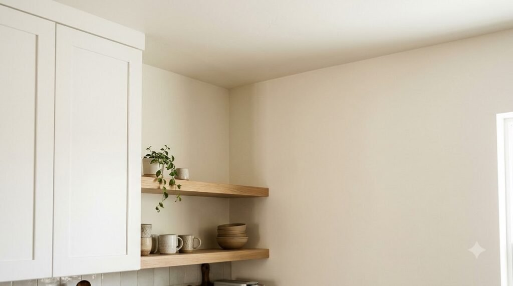
Best for: Kitchens with limited natural light, or anyone wanting a timeless, fail-safe look.
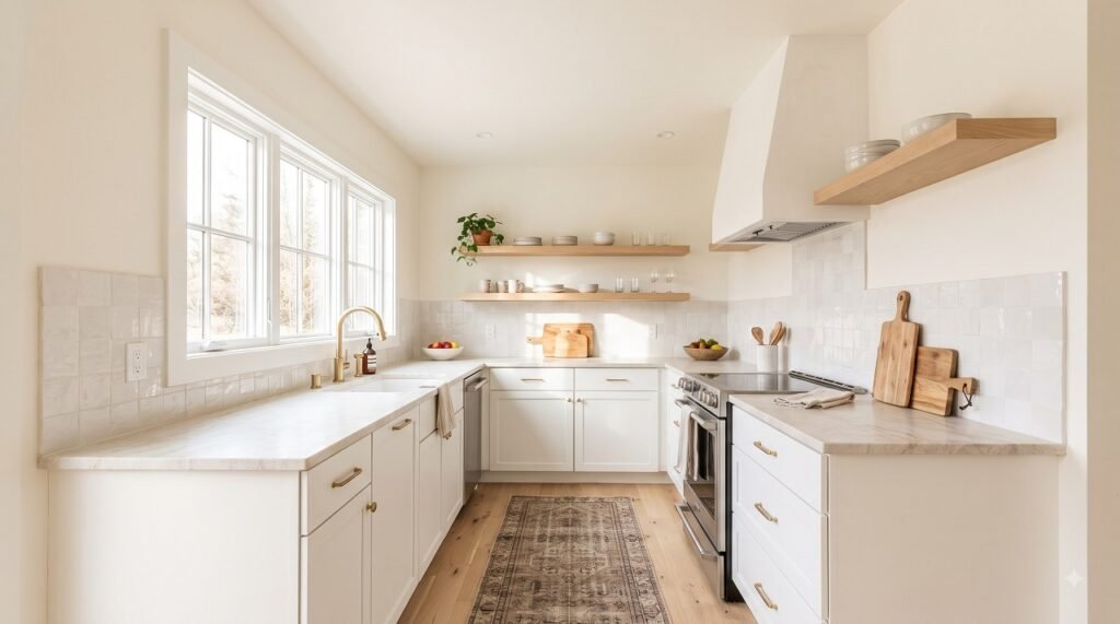
Pure white is harsh. Warm off-white—a white with a touch of cream or beige—reflects light beautifully without feeling sterile.-4
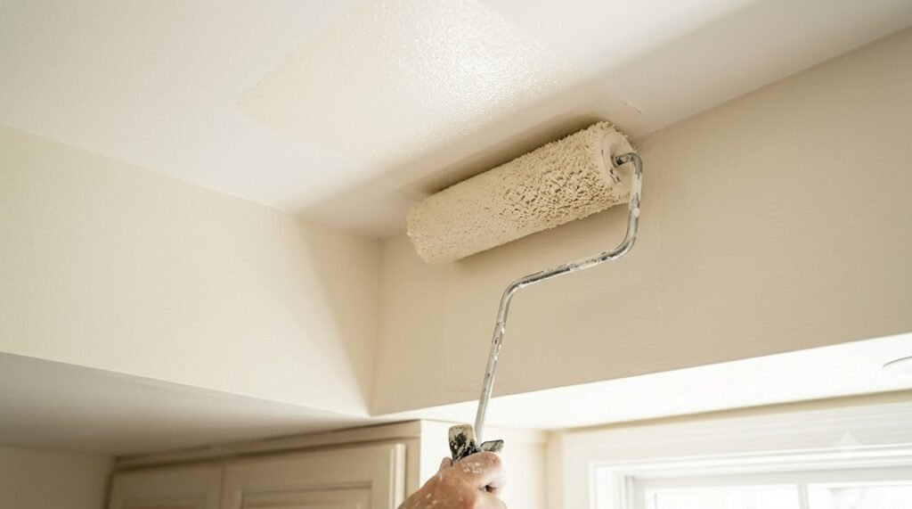
Why it works: Designer Lauren Saab recommends painting both walls and ceilings a soft, sun-washed white to create one seamless envelope. This eliminates the visual break between wall and ceiling, instantly making the kitchen feel taller and larger. Warm whites also hide greasy fingerprints better than cool whites and harmonize beautifully with wood tones.-4-5
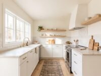
How to use it: Paint the walls, ceiling, and trim the same warm off-white in a satin or eggshell finish. Pair with light wood floating shelves and a pale countertop.
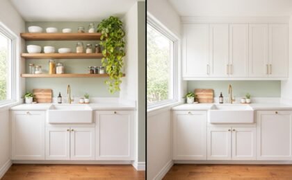
Want to make your walls work harder? Adding open shelving in the same color family as your walls is a brilliant way to continue the seamless look. See our full comparison of Open Shelving vs. Upper Cabinets to decide what goes on those walls.
🔍 Open Shelves or Cabinets?
If you’re using warm off-white to create a seamless look, open shelving can continue that visual flow. We broke down the honest pros and cons of both options.
Compare Open Shelving vs Cabinets →2. Soft Mushroom (The New Neutral)
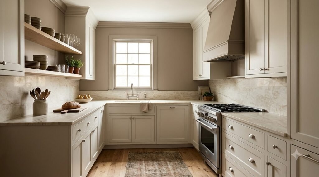
Best for: Kitchens with warm wood cabinets or beige stone countertops.
Forget cold, gray-toned neutrals. The color designers are reaching for in 2026 is a creamy mushroom with warm taupe undertones.-1
Why it works: Gentle and cocooning without darkening the space, this shade creates softness around cabinetry and helps harsh edges visually recede, making compact layouts feel less boxy. It adds a layer of sophistication and depth that makes a small kitchen look custom-built and expensive.-1
How to use it: Pair mushroom walls with brushed nickel hardware, warm woods, and creamy stone surfaces. It works beautifully on all walls, or as a two-tone scheme where the lower cabinets are a slightly deeper putty tone and the uppers are mushroom.-1-5
3. Smoky Blue (The Airy Depth-Builder)
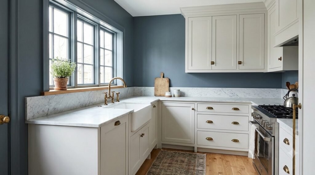
Best for: Kitchens with cool light, or spaces that get a lot of afternoon sun.
You don’t have to paint everything white to make a room feel big. A muted, blue-gray—softer than navy but richer than powder blue—brings depth while still feeling airy enough for smaller spaces.-1
Why it works: Light and midtone shades of blue add a sense of light and airiness to a small kitchen. Because blue sits at the cooler end of the spectrum, it visually recedes, making the walls feel slightly farther away than they actually are.-2-4
How to use it: Layer smoky blue with marble, antique brass, and soft white walls to keep the overall look light and balanced. If you’re nervous, use it on the lower cabinets only and keep the uppers white.-1
4. Muted Sage Green (The Low-Contrast Recede)
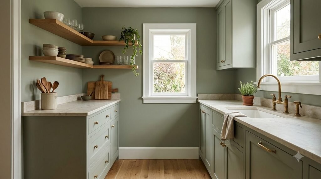
Best for: Adding personality without shrinking the room, especially in kitchens with open shelving.
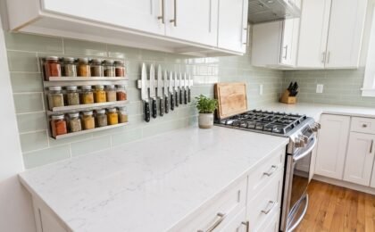
Sage green has been a designer favorite for years, but the specific shade matters. You want an earthy, muted green with gray undertones—not a bright, jewel-toned emerald.-1
Why it works: Designer Lauren Saab explains that muted green-gray hues are mid-value, low-contrast, and slightly muted, so they recede visually. The surface bounces less light back to the eye, letting it fall into the background instead of shouting for attention. This softness lowers visual noise and leaves the room feeling breathable.-4
How to use it: Pair sage green walls with warm white trim and natural wood tones. It looks especially sophisticated when combined with unlacquered brass hardware and open shelving.-1
5. Chalky Plaster Pink (The Light-Reflector)
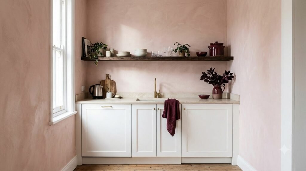
Best for: South-facing kitchens, or anyone wanting a warm, unexpected glow.
Barely-there pinks have become a designer secret weapon for making compact spaces glow. This isn’t a sugary bubblegum pink; it’s a chalky, plaster-like shade with a hint of warmth.-1
Why it works: A chalky plaster pink reflects light magically and softens the harder surfaces kitchens naturally contain—from tiles to stone and stainless steel. The result is a room that feels warmer, brighter, and unexpectedly elevated.-1
How to use it: Pair with burgundy accents, dark timber, and creamy whites for a modern, high-end look. It’s a brilliant choice for a small kitchen that gets good natural light but feels a little cold or flat.-1
6. Warm Ivory (The Expensive Glow)
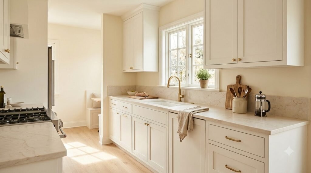
Best for: Traditional or transitional kitchens that need to feel instantly more spacious.
A soft, tasteful ivory is one of the simplest ways to make a small kitchen feel more expansive, but the key is choosing a shade with warmth rather than starkness.-1
Why it works: Warm ivory bounces light while feeling inviting, and it harmonizes beautifully with wood tones and natural materials. It’s a classic choice that never feels dated, and it makes the space feel bright, effortless, and clean.-3-5
How to use it: Paint the walls warm ivory and the cabinets a slightly brighter white. This subtle contrast adds dimension without chopping up the room. Test the shade under both natural and artificial light—some ivories can look yellow under LED bulbs.-5
7. Light Cool Gray (The Crisp Canvas)
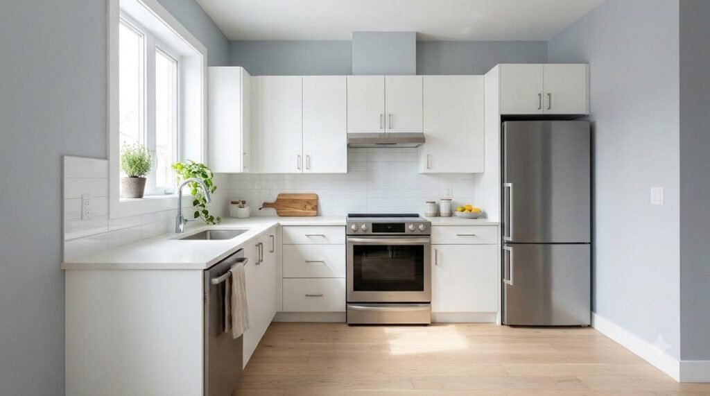
Best for: Modern, minimalist kitchens with stainless steel appliances.
Cool colors can lend a spacious look to a small kitchen. A soft, cool gray with subtle blue undertones reflects light beautifully and creates a serene, airy backdrop.-3
Why it works: Light gray acts as a neutral canvas that enhances natural light while giving the illusion of more square footage. It’s crisp and clean, and it pairs perfectly with a pop of color on the cabinets or accessories if you want to add personality without overwhelming the space.-3
How to use it: Pair light cool gray walls with white cabinets and stainless steel appliances for a seamless, modern look. Add warmth with a wood floor and a few textural elements like a woven runner or a ceramic vase.
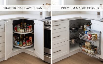
Struggling with the corner cabinet void? A cool gray palette makes the room feel crisp, but a cluttered corner still feels cramped. See our comparison of Magic Corners vs. Lazy Susans to reclaim that dead space.
📐 Reclaim Your Corner Cabinet
A cool gray palette makes the room feel crisp, but a cluttered blind corner still feels cramped. Compare Magic Corners and Lazy Susans to find the best storage solution.
Compare Corner Cabinet Solutions →The One Rule That Matters More Than the Color
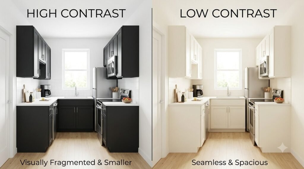
You can choose the perfect shade, but if the contrast is too high, the room will still feel small.
Color consultant Amy Krane explains that the more uniform the coloration is in the room, the less chopped up the room appears. And this uniformity leads to a bigger and more open feeling.-2
If you choose light cabinets with a very dark paint color, you’ll make the room feel more dramatic and potentially smaller.-2
The fix: Keep your walls, cabinets, and trim within a few shades of each other. If you want a dark accent, keep it to a single small wall or the island face, and keep the rest of the palette light and reflective.-5
4 Common Paint Color Mistakes in Small Kitchens
- Using stark, gallery white. It can feel flat and clinical in compact rooms. Always choose a white with a touch of warmth or depth.-1
- Creating too much contrast. Light cabinets against dark walls chop up the room. Keep the palette harmonious to maximize the illusion of space.-2
- Ignoring the light. A color that looks beautiful in a sun-drenched showroom might look dim and heavy in a north-facing kitchen. Always test swatches at different times of day.-5
- Forgetting the ceiling. Painting the ceiling a different color than the walls creates a visual stopping point. Paint the ceiling the same color as the walls to make the room feel taller.-4
Rental-Friendly Alternatives
If you rent and can’t paint, you can still use these principles:
- Removable wallpaper in a light, low-contrast pattern.
- A large mirror on one wall to bounce light and create a false sense of depth.
- Adhesive-backed paint swatches or large fabric panels hung on the wall to test a color before committing.
- Light-colored canvas art or a large leaning mirror.
Frequently Asked Questions
What is the best paint color to make a small kitchen look bigger?
Warm off-white is the most reliable choice because it reflects light without feeling sterile, and it creates a seamless envelope when painted on walls and ceilings. Soft mushroom and muted sage green are the best choices if you want a color that still feels expansive but adds character.-4
Should I paint my small kitchen white?
Yes, but avoid stark, cool white. Choose a warm off-white or ivory with a touch of cream. Clean gallery whites can feel flat and clinical in compact rooms, while warm whites bounce light and feel inviting.-1-5
Should walls and cabinets be the same color in a small kitchen?
Yes, painting them the same or very similar shades creates a seamless, uniform look that makes the room feel larger. If you want contrast, use different finishes (matte cabinets, satin walls) rather than different colors.-5
What color should I paint my small kitchen ceiling?
Paint the ceiling the same color as your walls. This eliminates the visual break between wall and ceiling and makes the room feel taller and more expansive.-4
Are dark colors bad for small kitchens?
Not necessarily, but they require careful handling. A dark color on a single accent wall or the island face can add depth and character, as long as the rest of the palette is light and reflective. Dark colors on all walls can make the space feel like a cave.-5
Conclusion
You can’t add square footage to a small kitchen, but you can change the way it feels. The right paint color—applied with a low-contrast, light-reflecting strategy—can visually double the size of your space for the price of a gallon of paint.
Here’s the quick action plan:
- Choose a warm, nuanced shade from the list above (warm off-white, soft mushroom, or muted sage are the safest bets).
- Paint the ceiling the same color as the walls to create a seamless envelope.
- Keep the contrast low between walls, cabinets, and trim.
- Test your swatches under both natural and artificial light before committing.
Do these four things, and your small kitchen will stop feeling like a box and start feeling like a breath of fresh air.